Additional Features > Weight Distribution
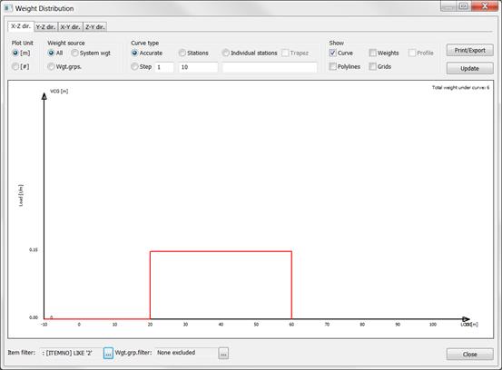
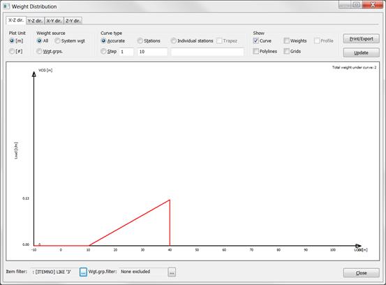
The following attempts to describe how weight distribution is calculated in ShipWeight. In general, ShipWeight approximates the distribution for each individual weight item to either a uniform, triangular or trapezoid distribution. These individual items are then added together making up the total “accurate” distribution. The accurate distribution can be converted to a distribution of stations or bars.
Consider the following weight items:
Nr |
Weight |
LCG |
LCG_min |
LCG_max |
1 |
10000 |
50 |
0 |
100 |
2 |
6000 |
40 |
20 |
60 |
3 |
2000 |
30 |
10 |
40 |
4 |
2000 |
58 |
50 |
70 |
In ShipWeight, the distribution of these items will individually be represented like this:
1. Item with uniform distribution:
2.Item with uniform distribution:
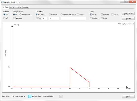
3.Item with triangle distribution – LCG located at 2/3 of the items extension
4.Item with trapezoid distribution – LCG between 1/3 and 1/2 of the items extension
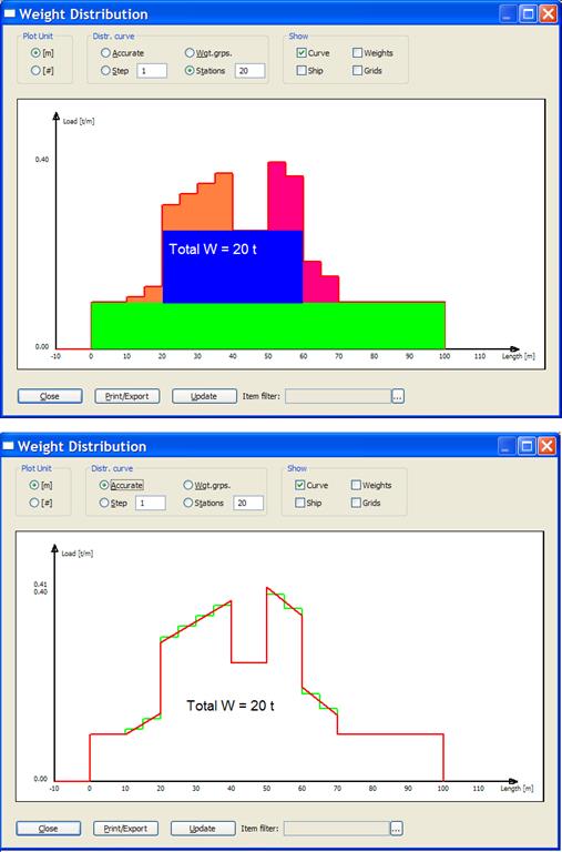
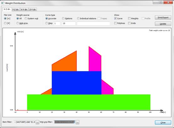
When ShipWeight calculates its “accurate” distribution, the items are added together. Compare the colors in the individual representations with the colors of the “accurate” representation to locate each weights item’s contribution to the total curve.
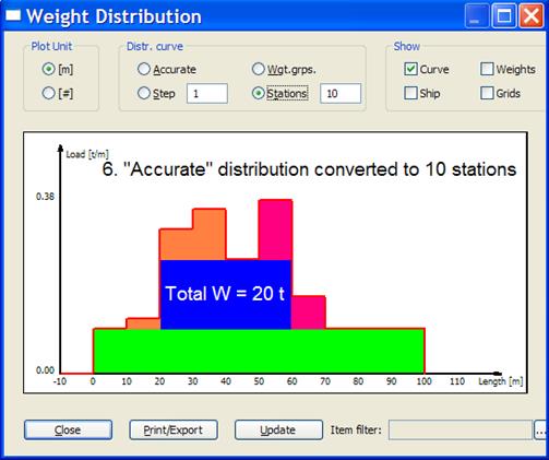
The user may choose to represent this curve in stations. ShipWeight calculates the stations by dividing the “accurate” curve into the number of stations to be plotted. Each share of the “accurate” curve is integrated giving the area under the curve between the stations. Next this area will be represented by a station or bar with the same area as the curve area it replaces.
This secures a one to one relationship in area between the “accurate” curve and the station curve. Further, this means that the area contribution from individual items which distribution is covering more than one station will be split into appropriate parts in each station. This secures the best possible conversion between “accurate” and station curve.
See figure on next page representing the station version of the curve. Again, the colors will help compare the curves to visually inspect how conversion takes place.
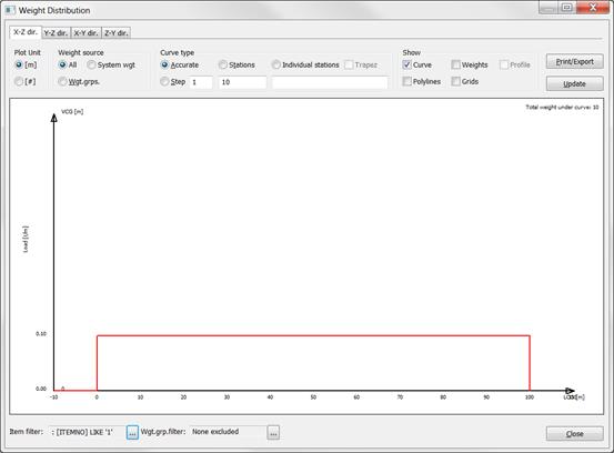
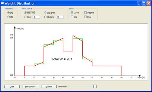
In both cases, the area under the distribution curve equals 20 tons. The figure below shows the “accurate” curve drawn in red with the station curve superimposed and drawn in green. This shows how the curve is transformed and the area preserved.
Of course, the same reasoning is also valid with any other number of stations, not just 10. The figures below shows same principles for the distribution curves as discussed above, only this time with a 20 station curve.